CareerBuilder: Resume Builder
ROLE: CO-led initiative. Helped with ID work
WHAT: B2C Job Search + CareerPathing App | 10-day UX Innovation SPRINT
OPPORTUNITY SPACE :Hourly workers make up 60% of the American workforce and account for 80% of all hires in the U.S. Our current product line-up did not address these users. Our goal was to create a new experience for hourly job seekers through a mobile app. Below is a case study into the resume building flow and optimization for a 10-day innovation sprint.
PROCESS SNAPSHOT
In true spring fashion, I love how we didn't need to do anything "formal" for this project. Road map was on the board. IA was with stickies. Prototype was in Marvel (that made things SO fast) before we moved it to InVision.
MENTAL MODEL EXERCISE:
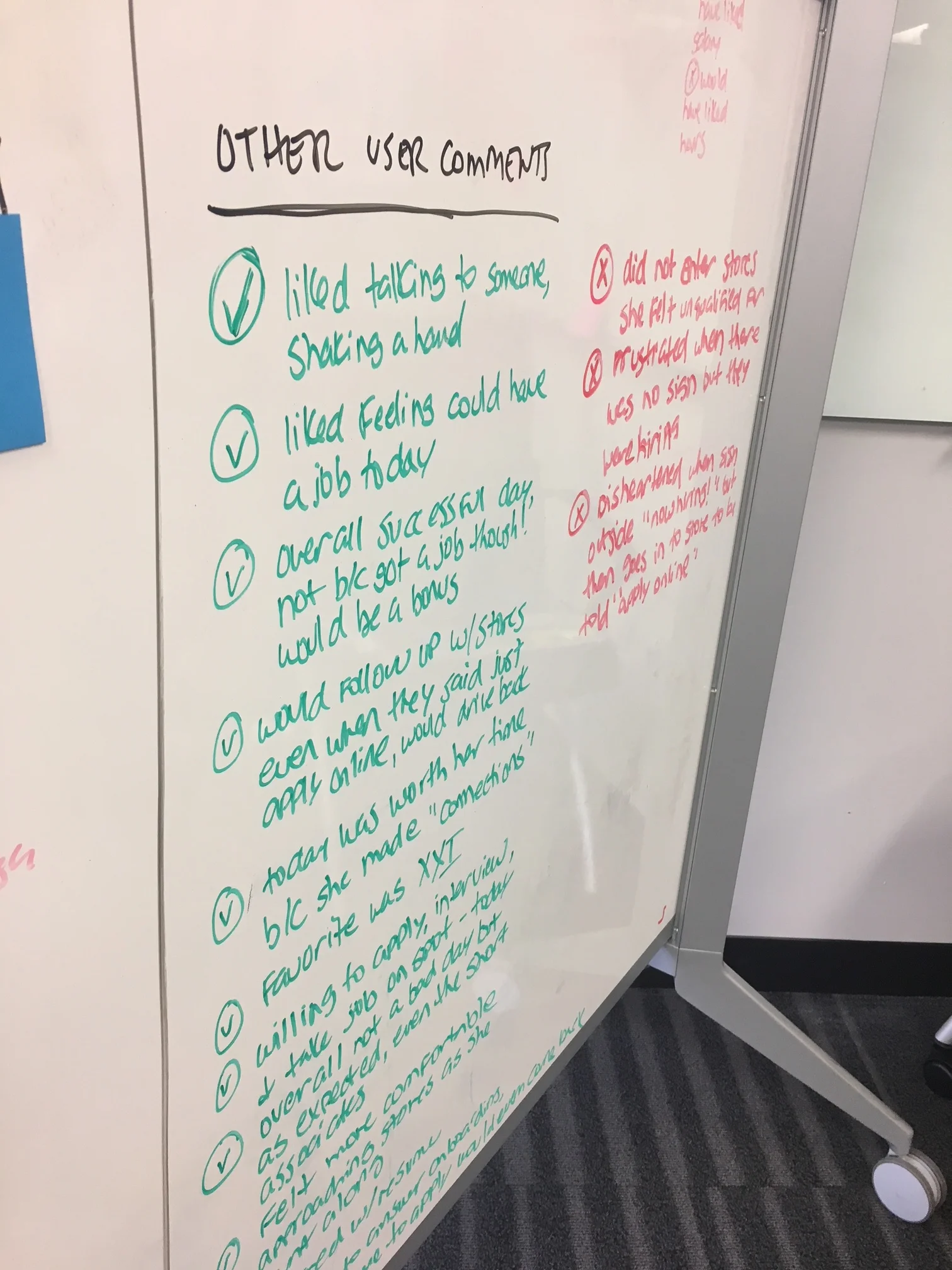
In addition to all of our existing research, we started by finding an active hourly job seeker and observing her around the mall as she looked for a job. We were able to identify what an ideal flow would be and several fail flows. We were also able to identify opportunities to improve the job seeking experience (handprints come as a bonus).
LO FI MOCKS

GAP ANALYSIS
After presenting our final clickable concept to stakeholders, we received buy in to move it into our normal product cycle tracks. We had a scoping session with DEV + PO + UX to assess work, sprints, and gaps.
I’ve shown a few of the gaps + clean up we identified. There were many more.
Getting the flow right with AB TESTING
As users want to add more jobs/schools to their history and experience, we had to think about how that interaction would work.
Option 1: Fill out a continuous form adding one job after another on one page - which would save clicks but be a longer scroll.
Optio 2: Clicking on a button "add a job/school" and then transitioning to it's own page with a save button between each job so that the user could see their progress and commit it.
My assumption was, sometimes the illusion of "fast" is faster even if it requires more clicks. Sometimes you can achieve that with the right microinteractions.
Based on the results, it was very close but we decided to start with Flow B with our V1 release.
Results from the test showed:
56.34%
Flow B
43.66%
Flow A
SUGGESTIONS TO THE NEXT TEAM
I moved onto other initiatives and was not at the company to see how this turned out, but we handed off our suggested next steps
Inspired by Amazon's app checkout summary page, what if our summary and editing page at the end of our current flow, that also tested great, was actually the starting page?
1. Since we were working towards an almost complete auto-populated resume, I could skim and Apply/Save in all of one-click. Yes. ONE.
2. This would essentially take Flow B and have the empty states all on one pages.
3. If the parsing from a document or another website wasn’t perfect (we know how this can be), it makes it easier to see the areas that are missing and incorrect.
4. If I didn’t have education or work experience, I could skip without having to click anything.
5. This sets up for some nice opportunities in the future to let a user choose their own path to give a user a guided step by step version which might be good for first time resume builders. Also lets a user do it independently especially helpful i when when you are a pro.
Below are some visual design explorations I handed off as well.


