Candidate Search Results
Role Visual + IxD + Partnered on research (this was a long term project which became collaborative with other designers)

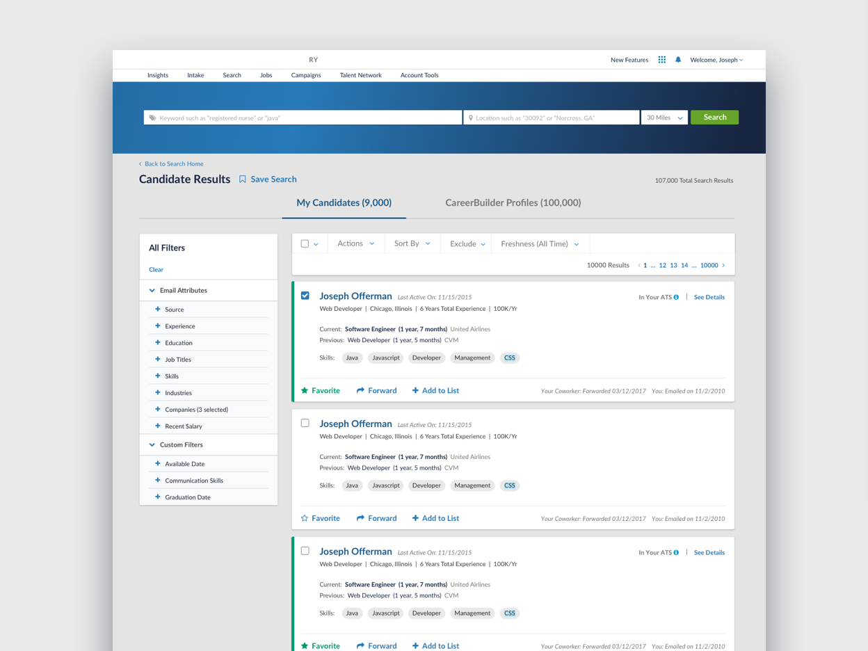
PROBLEM: Ongoing work on B2B Enterprise Search results page was the hub of 3 separate databases of candidates that had been worked into one UI.
LACK OF RESOURCES AND TIME TO IMPROVE
Since we don't have time or resources to look at research, can we leverage what we already have? We had several rounds of studies done already on users interacting with a search results and saving candidates for later.
Can we look to trends out there for a quick audit on some common card patterns?
Can I somehow hit the needs of stakeholders but embed them within update design?
CONCERNS IN LEFT DESIGN (BELOW)
More actions
More dates that look the same i.e. my last activity date as a recruiter or the candidate's last activity date
Long names/company names (how does this fit in the card nicely along with all the other information
Not responsive
ADDRESSING THE DESIGN PROBLEMS IN RIGHT DESIGN (BELOW)
Following common card patterns and social media card patterns, actions were moved to the bottom footer of the cards. That gave it more room to grow and also more room for overly long candidate names and company names.
Create a spot for actions ON the candidate away from the candidate details to keep recruiter actions and coworker actions separate.
Reduced the number of skills displayed on card based on previous research
With the actions moved to the bottom, you couldn't tell which card it belonged to so I opted to make each card individual. This also gave it a bit more breathing room.
Changed the behavior of how quick saving worked - i.e. Favoriting
Started working on action hierarchy. We planned to add an "exclude/hide" action which was a negative/secondary action.
ADDRESSING THE BUY-IN PROBLEM
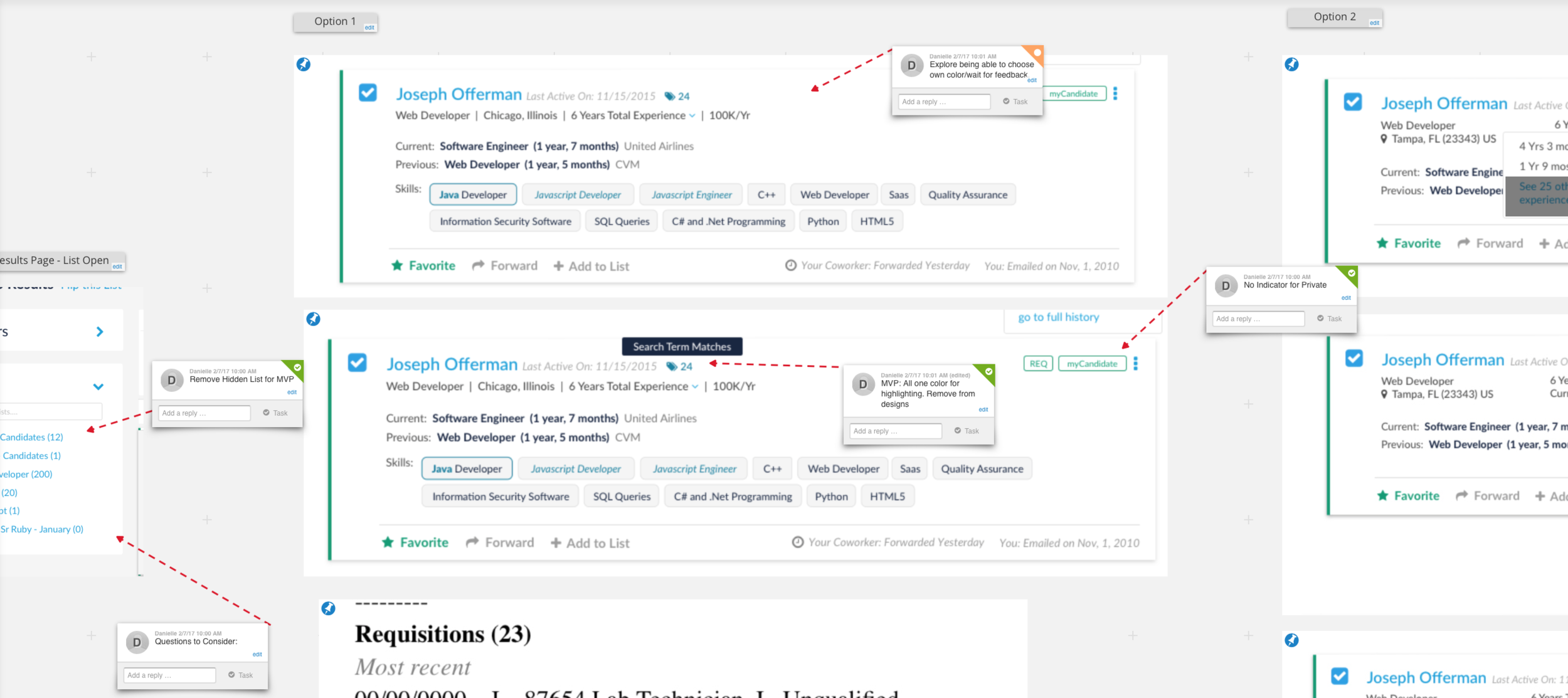
Created a collaborative workspace (before we started using InVision. This was the first of its kind on our team. Being that I had so many stakeholders and so many converging UIs, parity requirements, new feature requirements, etc - I wanted a centralized way for everyone to give feedback, see progress, and look towards the bigger picture.
Using this tool helped paint the need to move to a new layout and the flexibility it would bring to more parity items.


